Introduction
The quantity of natural emissions of CO2 into the atmosphere as used in existing models is no better than an educated guess. It is mistakenly assumed to be balanced out by natural sinks to show that burning fossil fuel emissions accumulate in the atmosphere. Thus, natural emissions are not included in the material balance used in the models. The reported residence times or e-folds are actually fudge factors that allow model material balances to approximate observations.
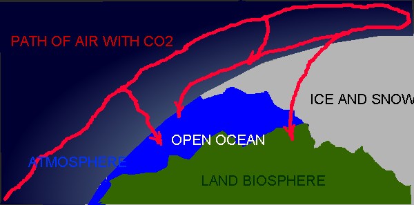
Most of the natural flow of CO2 is from tropical and mid-latitude ocean sources to polar ocean sinks. Thus, material balances on these zones should give us better estimates of natural fluxes of CO2 in the atmosphere. The two main sink zones are 1, north of 45 degrees North and 2, south of 45 degrees South. The source zones are between 45 degrees South and 45 degrees North. The source zones are where the net vertical flux of air, moisture, and CO2 is up primarily as a result of thunderstorms . The sink zones have vertical flows that are down because of a perpetual inversion ( the surface is colder than the air above it).
A Simple Vertical Flow Model
The climate change models being used to predict future conditions are basically highly modified horizontal flow weather forecasting models into which they try to include too many physical parameters that they hope will consistently fit past observations. First of all, weather models all have wide ranges of possible paths when applied more than a week into the future. Second, if you include too many parameters in the analysis of data, you can get a good fit or correlation that is meaningless. Further, averaging a bunch of meaningless model results, only gives you another meaningless model average.
The re-analysis model (ESRL : PSD : Monthly Mean Timeseries) is a vertical model that parameterize the relationships between temperature, pressure, atmospheric water content, and resulting OLR The numerical equations they use are digital representations of a phase diagram for water. This model does not include CO2 or the possible effects of CO2 on OLR. Monthly averages, of over both time and space, average out most of daily changes in flow rates of both mass and energy caused by the night and day cycle. However, these averages can have significant effects on the net long-term changes.
Fortunately, NOAA measures and records hourly meteorology data at four “base-line” CO2 monitoring sites ESRL Global Monitoring Division – FTP Navigator. These sites are sites where Scripps has been monitoring CO2 changes Sampling Station Records | Scripps CO2 Program. The numerical equations used to analyze the monthly averages can be applied to these hourly averages to get a more accurate estimate of vertical fluxes as they change with time. Also, CO2 concentrations and fluxes can be included in the model. To logically include CO2 in this model, reported CO2 values should be converted from ppm to kg/m^2 at sea level pressure in a vertical column. The conversion factor I use is 44/28.8/1000000*10.197*1013.
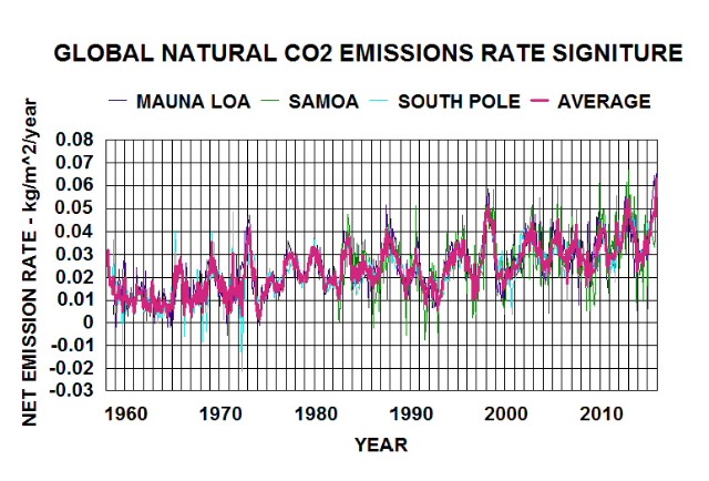
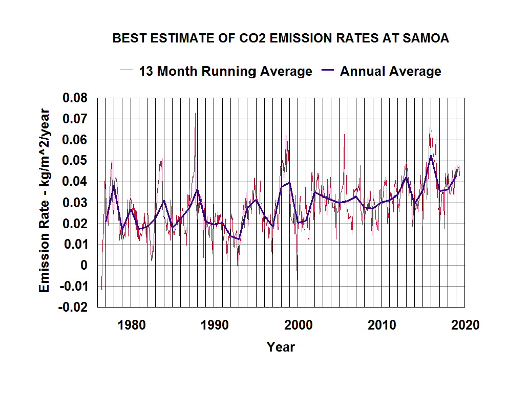
The four base-line sites are Point Barrow (sink zone), Mauna Loa (source zone), Samoa (source zone), and South Pole (sink zone). The sink zones are not significantly affected by daily radiation changes because the light/dark cycle is a year long with a low sun angle during the light phase. Samoa (emission zone), exhibits the least seasonal variation in atmospheric CO2 concentration and the most daily variation among the four sites. Figure 1, of five years (1997 to 2002) of hourly average data illustrates this behavior at Samoa. I chose this period because the spreadsheet I use has a limited data capacity and the dates include a major el Nino event.

Figure 1. Hourly average atmospheric CO2 concentration in a square meter column, at standard sea level pressure, during an el Nino event. The green graph is the running 25 hour average.
The difference between the hourly and daily graphs indicates that most of the emissions during a day are returned to the surface within a day. Both rain and down-drafts are the downward flux mechanisms. The average daily standard deviation is comparable to an ocean/atmosphere exchange rate (both up and down) of around 50 kg/m^2/year; which is much larger than the net exchange rates indicated by daily averages (green line). The green line represents the emission rates of CO2 out the tops of thunder-clouds; that are being delivered in the upper atmosphere to the sink zones, Thus, the year-to-year differences indicate gradual increases in the net emission rates (not accumulation).
A similar analysis of the reported daily average CO2 data is additional evidence that natural emissions have been increasing from year-to-year. Figure 2. is based on NOAA’s reported daily average data for Samoa.
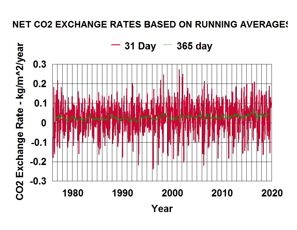
The year-to-year changes (green line) are much smaller than the month-to-month changes (red line). So most of the annual emissions in source zones are being returned to the surface at sink zones. A small fraction (green line) represents a relatively small net increase in year-to-year emission rates. Carbon dioxide does not accumulate in the atmosphere beyond a year. The concentration does build up over freezing sea ice during winter.
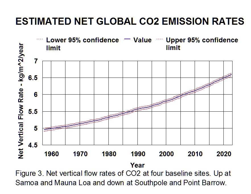
Most atmospheric CO2 concentration data are recorded as monthly averages and annual averages can be calculated from these values. So the green line in Figure 2. can be calculated from the monthly data. It should be noted that these running year-long averages are similar to a second derivative rather than a first derivative (rate of change in emission rates rather than emission rates). Figure 3. shows such calculated estimates for net changes in emission rates at Samoa.
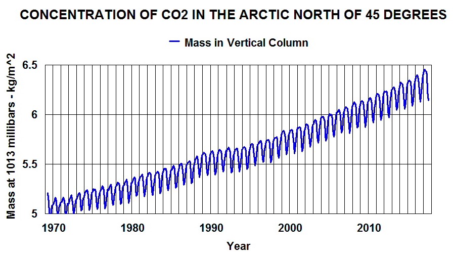
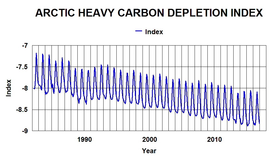
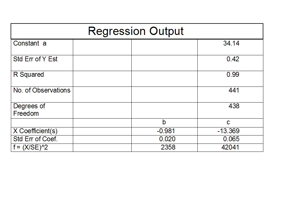
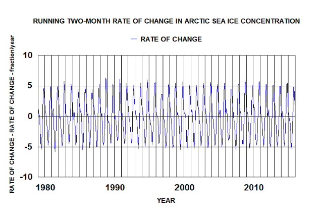
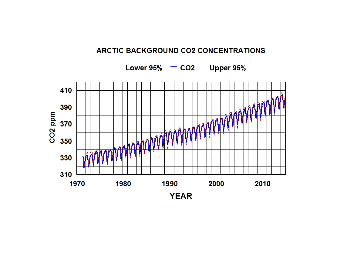
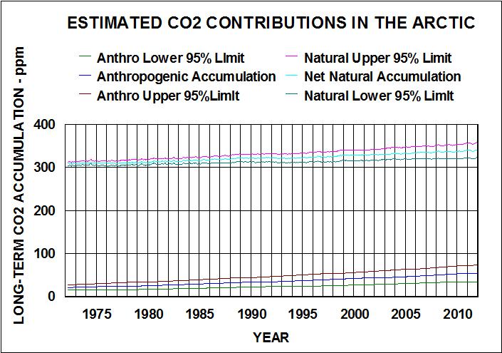
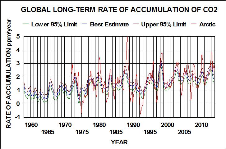
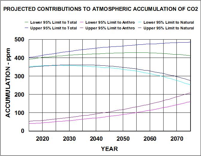
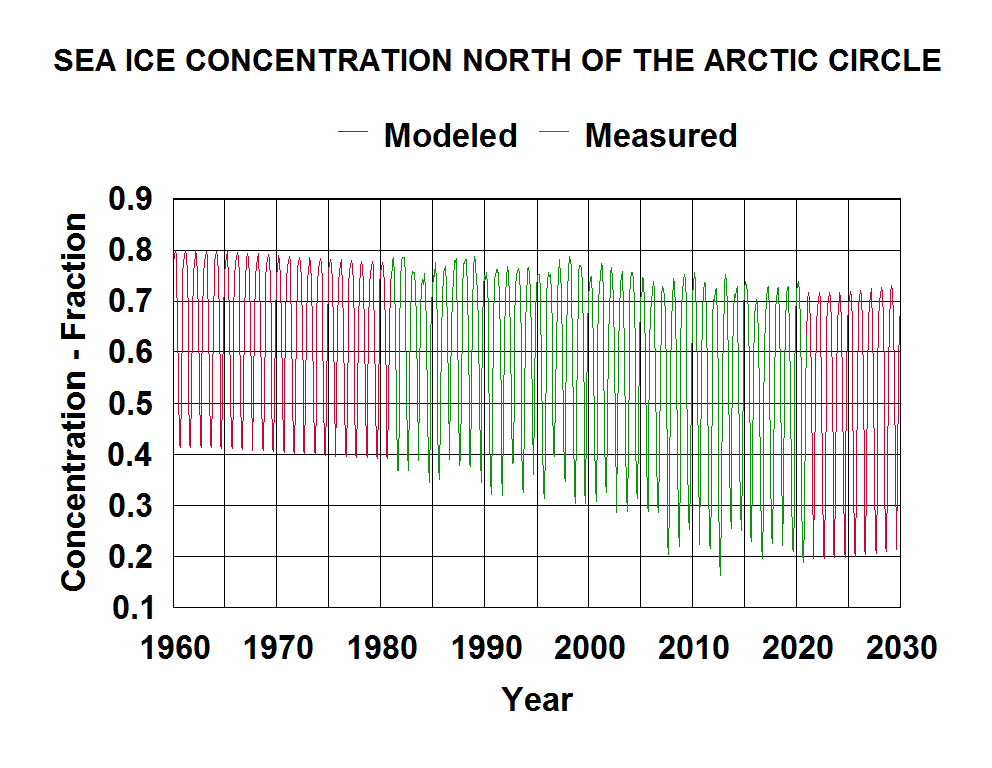
Scripps has two CO2 measuring sites in the northern sink zone; Alert, Canada and Barrow Alaska. They measure monthly average CO2 concentrations at five sites, that are in emission zones, that are influenced by northern sink rates. The monthly averages at these sites can be analyzed to calculate the net within year sink and emission rates as well as the year-to-year change in net rates. The month-to-month changes in CO2 concentration is a measure of the sink rates in the sink zones. The big sink is the cold open water of the Arctic Ocean and, thus, sink rates are directly related to sea ice concentration changes with time. Satellite measurements of sea ice concentrations in the Arctic started in 1981 (Climate Explorer: Starting point). I have analyzed the reported data for area north of the Arctic circle (665 degrees north) and used curve fitting to estimate values between 1960 and 2030. The results are shown in Figure 4.
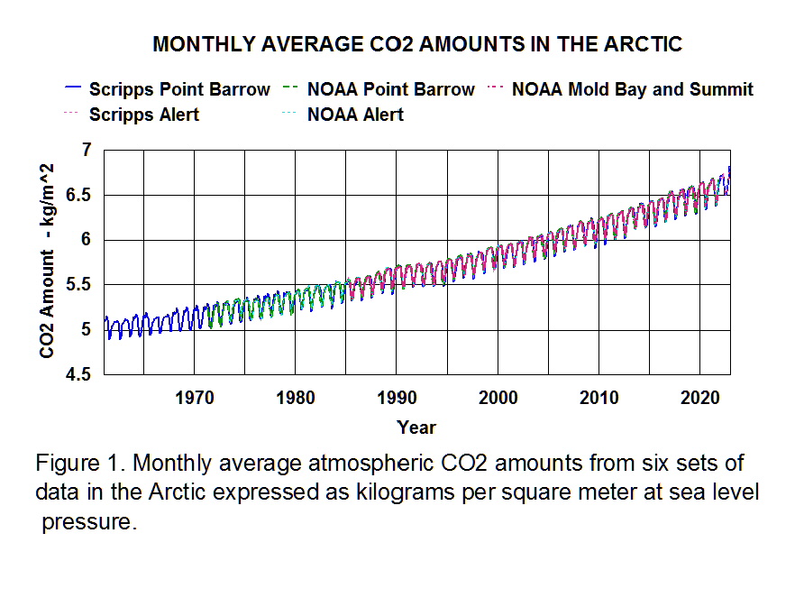
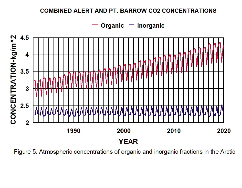
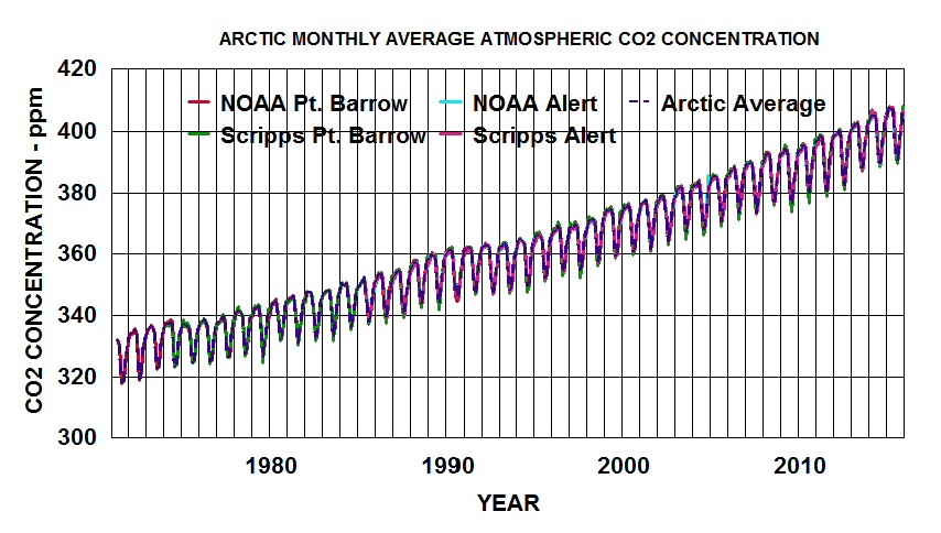
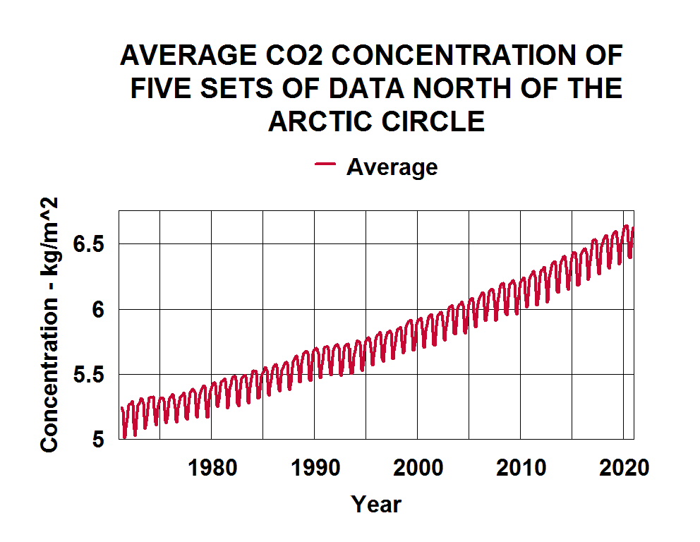
Both Scripps and NOAA have measured CO2 concentrations at multiple sites north of 66 degrees. Analysis of five of these sets of data indicate that the air over this area is very well mixed and the measured values are not statistically different from site-to-site. Figure 5. presents the average value as a function of time for these five sets of data. The width of the line approximates the calculated standard deviations.
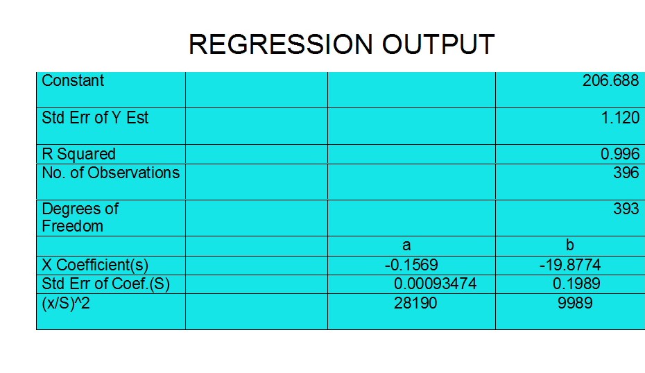
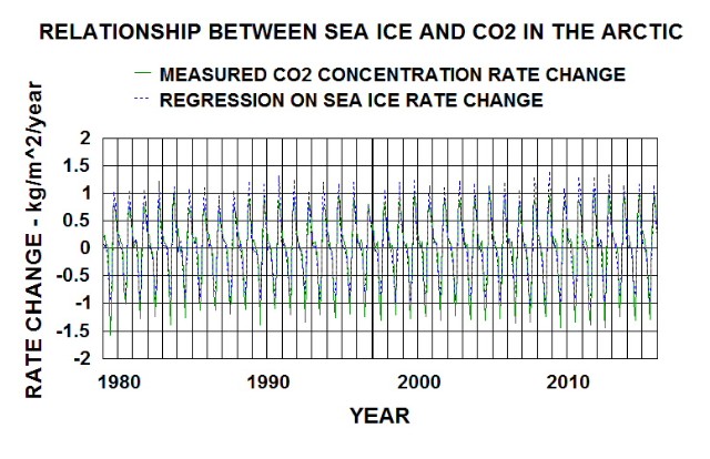
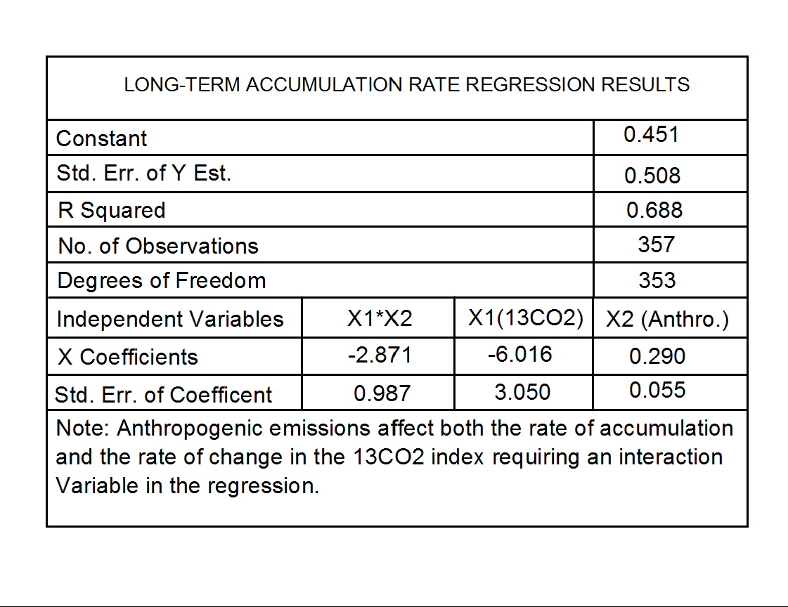
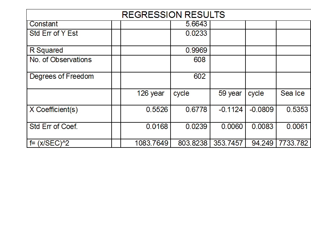
The within year variations in Arctic CO2 concentrations correlate well with the variations in Arctic sea ice concentrations (fraction of surface covered by ice). Table 1. regression results are very strong evidence to this fact. Figure 6. illustrates the degree of fit between the statistical model and observations.
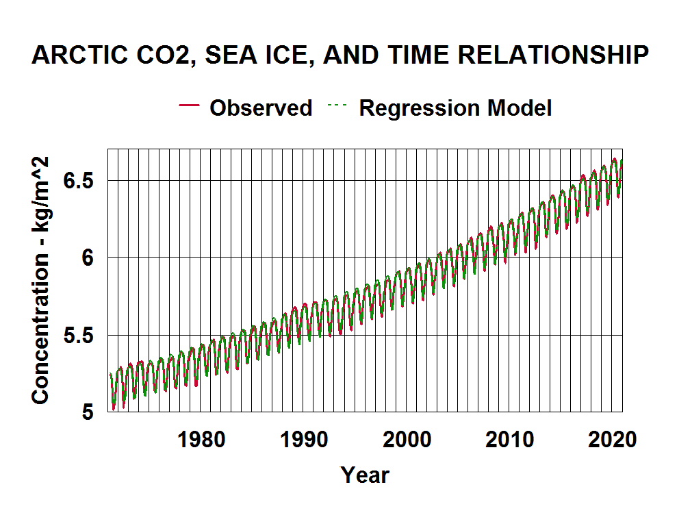
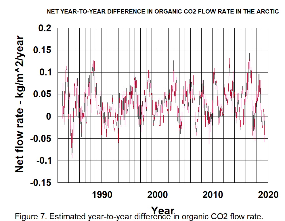
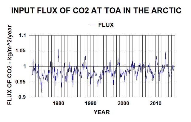
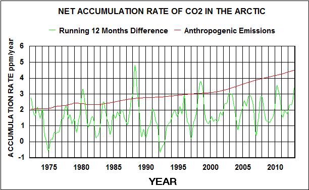
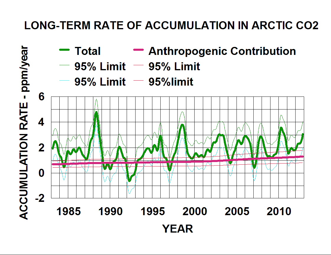
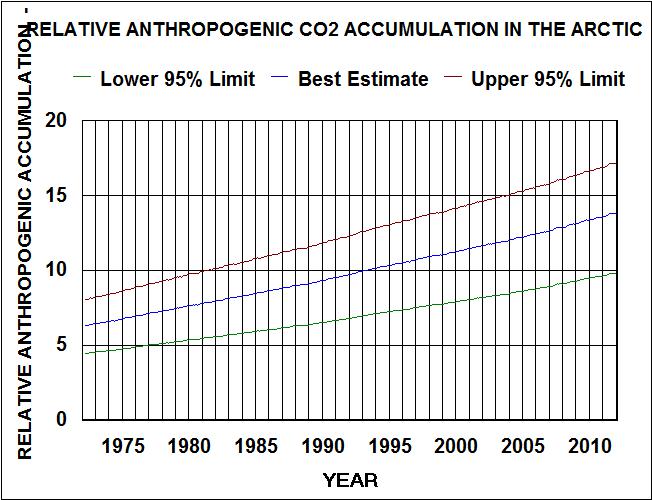
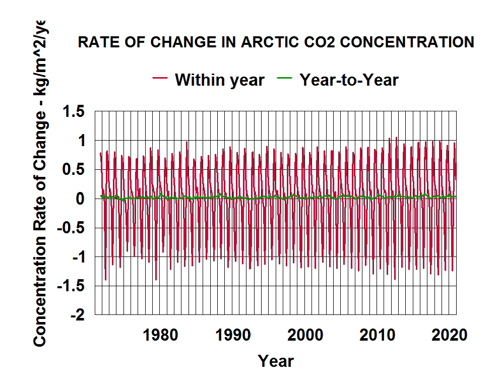
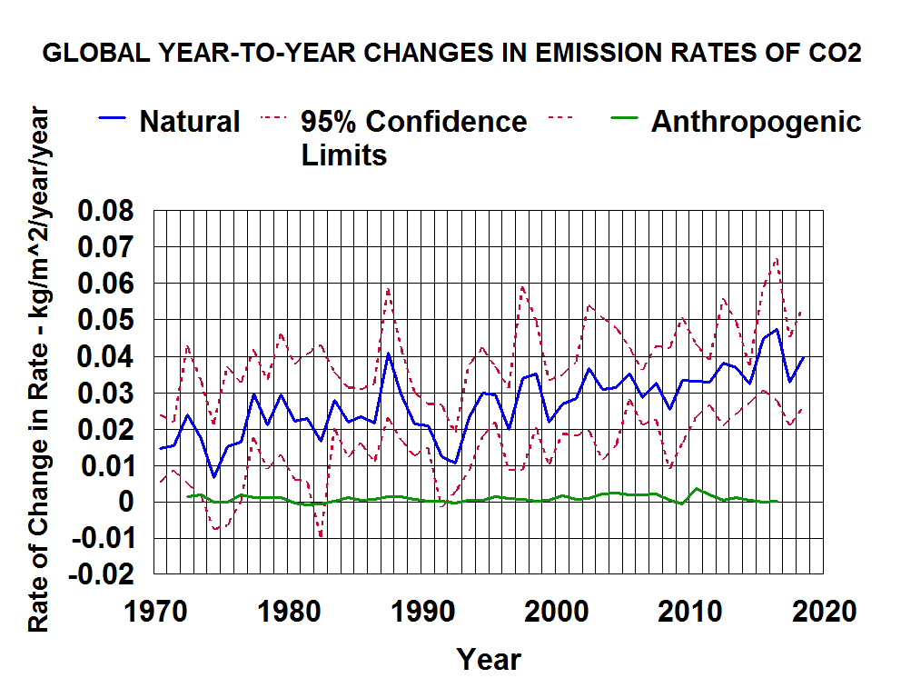
The constantly changing slopes of the curve in Figure 6. reflects both the within year changes related to sea ice freeze and thaw and long-term increases in emission rates from emission zones being delivered to the Arctic. Figure 7. shows the relative contributions of each. At zero on the graph, the sink rates in the Arctic are equaling the emission rates being delivered to the Arctic. Since the green line represents the year-to-year increase in these emission rates, at least two standard deviations of the data indicated by the red line should be added to the values of the green line to get an estimate of the actual emission values. The Arctic ocean is not a source of CO2.
Similar analysis of Antarctic CO2 concentrations and sea ice concentrations between 45S and 65S indicates that about 58% of the within year variability of CO2 is being controlled by the within year variability of sea ice (from near zero to around 15%). There is more cold open water year-round around the Antarctic than there is in the Arctic which results in less within year buildup; thus, less within year variability.
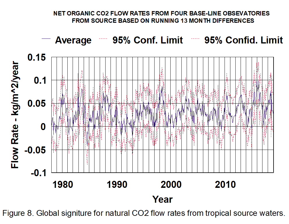
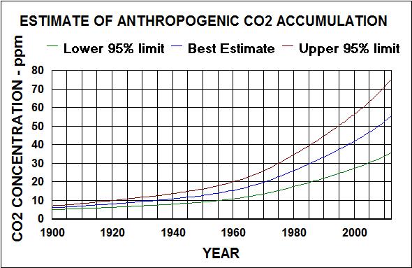
The long-term changes in emission rates of CO2 delivered to the Arctic are illustrated in Figure 8.
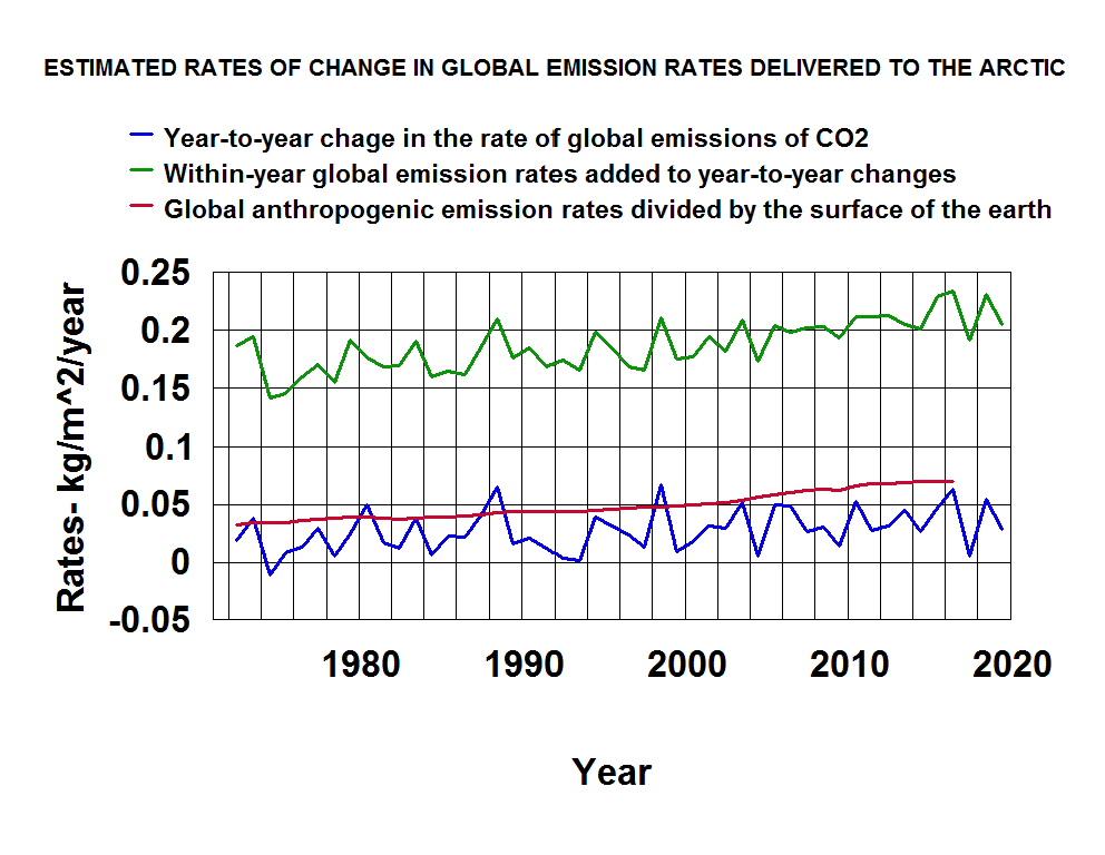
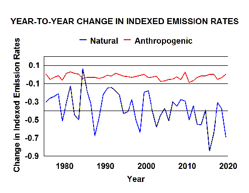
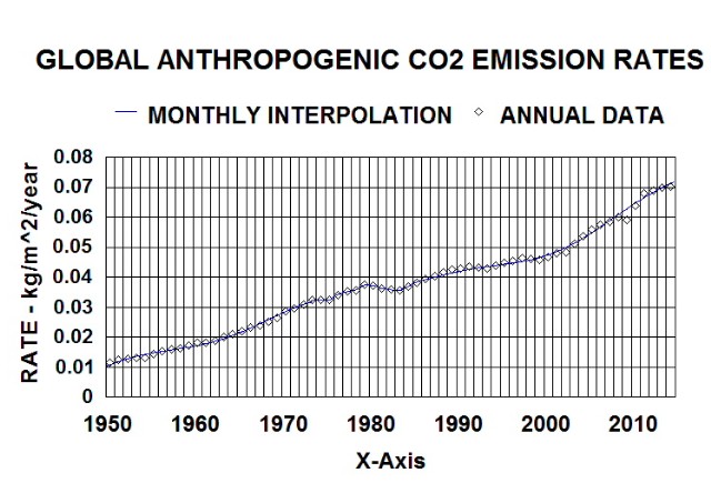
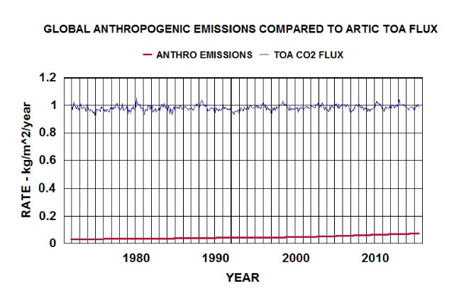
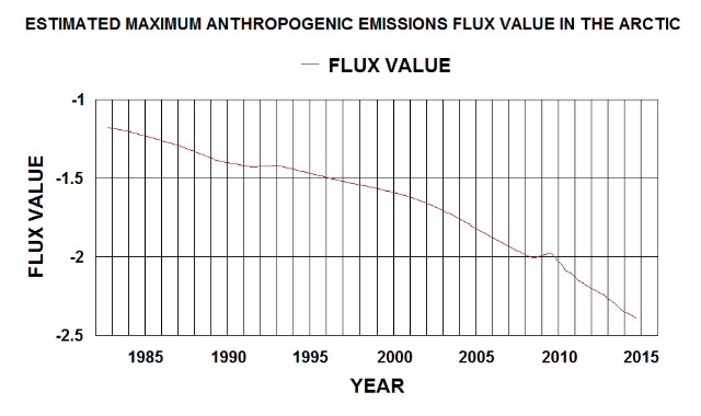
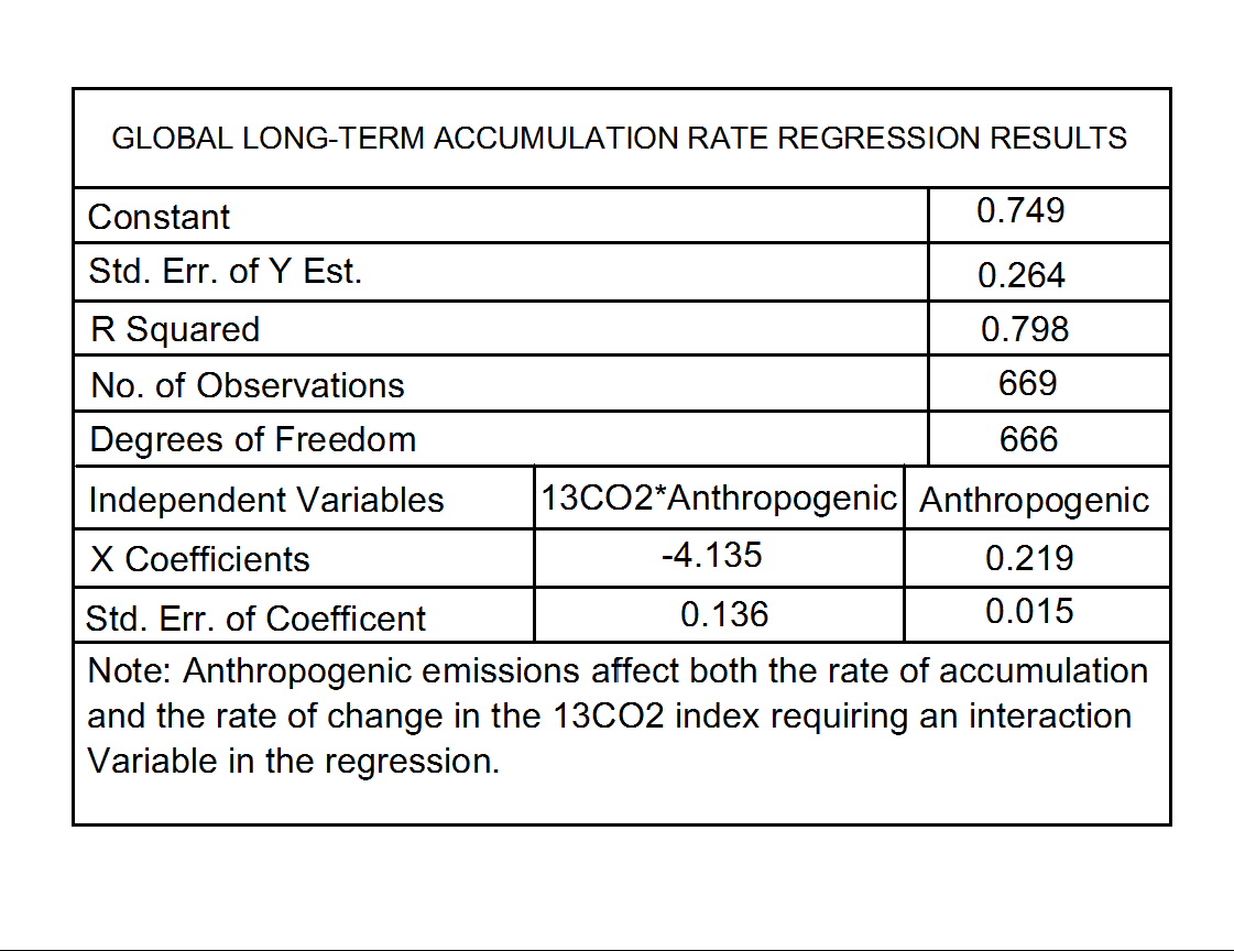
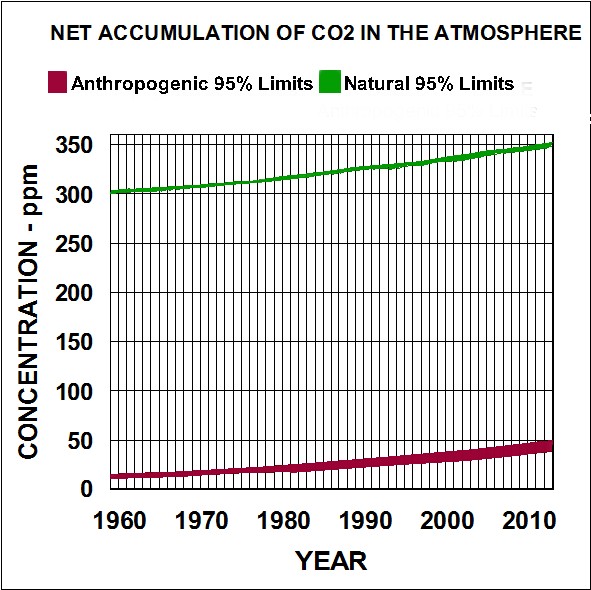
At least two big mistakes have been made by IPPC modelers in their assumptions associated with their mass balance model. Using a global annual average anthropogenic essentially assumes those emissions are instantly distributed via the upper atmosphere over the entire surface of the globe. That requires that none of the short term sinks (such as rain from clouds) do not function on man-made emissions as they do on natural emissions (reducing Arctic delivered emissions by at least three orders of magnitude). Thus, the values around 0.05 as shown by the red line are more likely to be around 0.00005 kg/m^2/year.
The other big mistake is assuming that the blue line essentially shows accumulation rather than increases in natural emission rates. That way they can claim that global anthropogenic emissions are more than enough to account for the accumulation and a regression correlation indicates about half those emissions go into sinks. There is a big difference between 0.5 and 0.999 fraction going into all active sinks.
Global signature for natural emissions of Carbon Dioxide
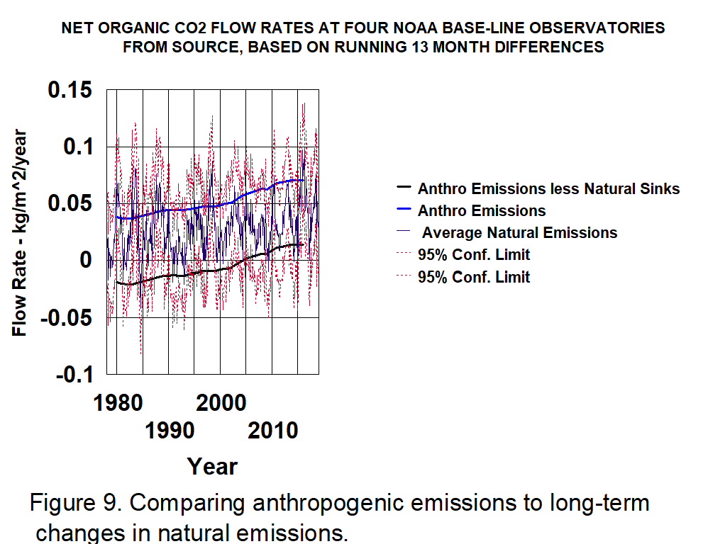
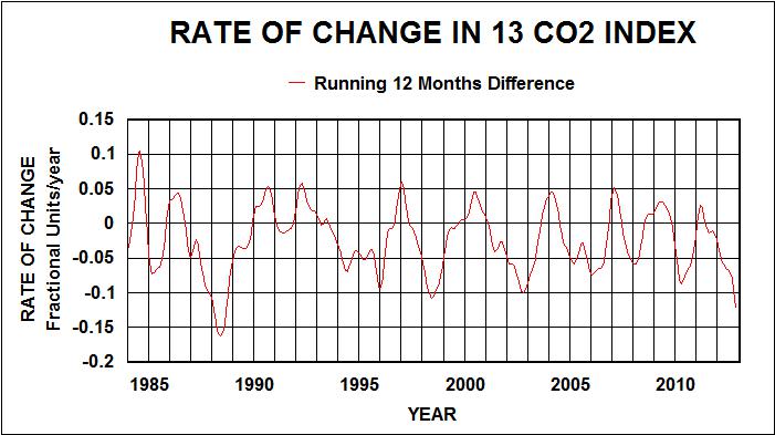
A similar analysis of monthly average data from all ten Scripps sites was performed. Thirteen month running averages of column 9 data were calculated then averaged to give the results shown in Figure 9. This confirms the validity of the estimated natural emissions being delivered to the Arctic.
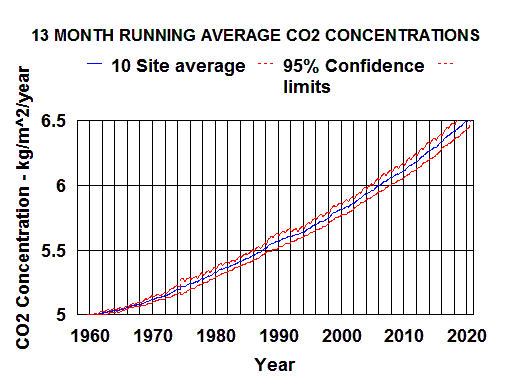
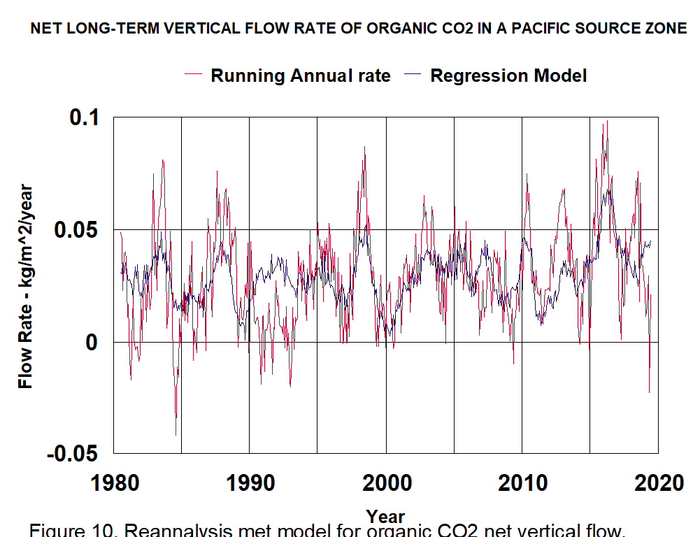
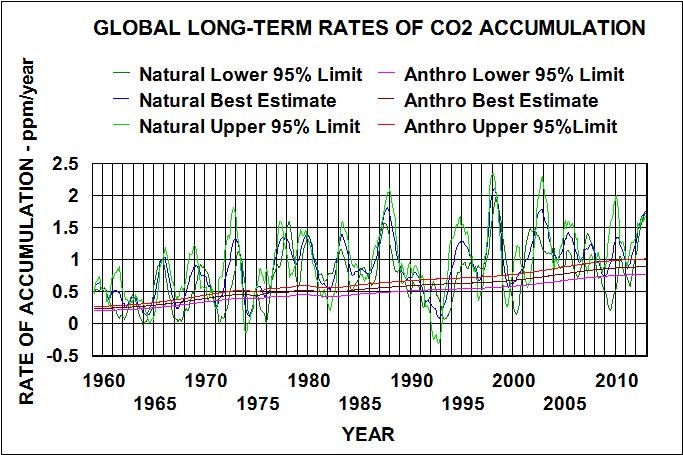
The results shown in Figure 9. is strong evidence that all CO2 emissions (both natural and man-made) are returned to the surface of the earth within a year. The year-to year change in the slope shows the year-to-year change in emission rates. Figure 10. shows these changes as well as year-to-year changes in anthropogenic CO2 emission rates.
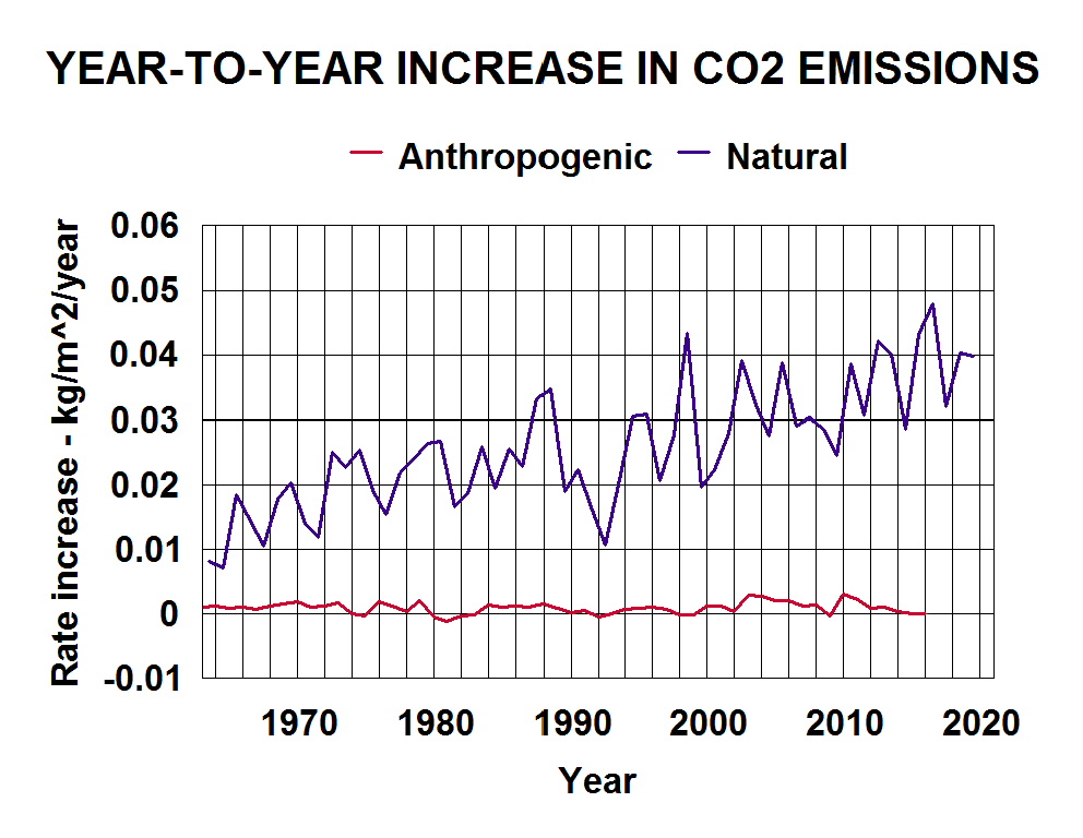
The red line representing anthropogenic emission rate changes does not consider the effects of within-year sink rates such as rain, soil, trees.etc. So it is practically impossible for anthropogenic emissions to contribute to the measured global rate increases as shown by the blue line.
The IPPC’s “smoking gun” evidence
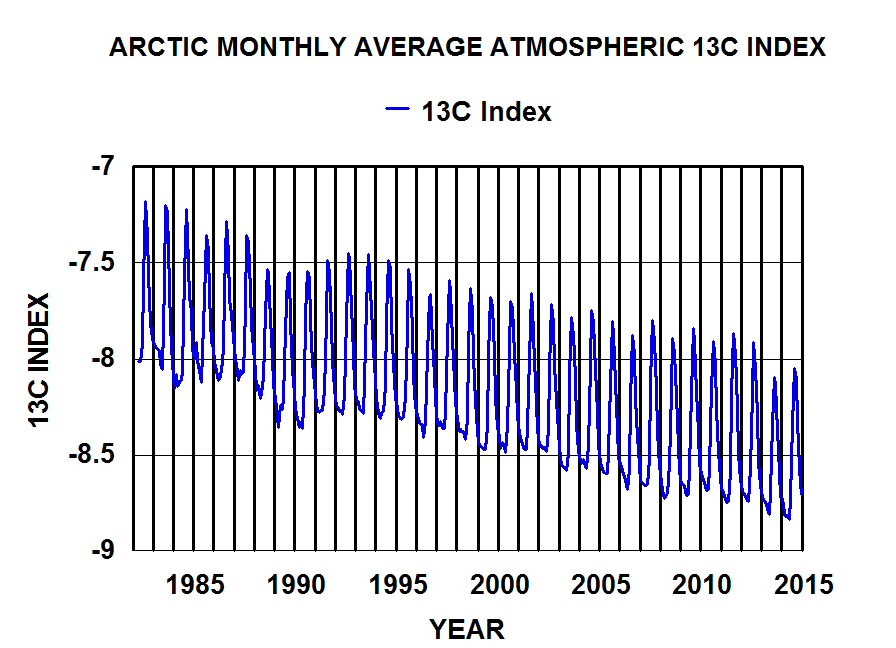
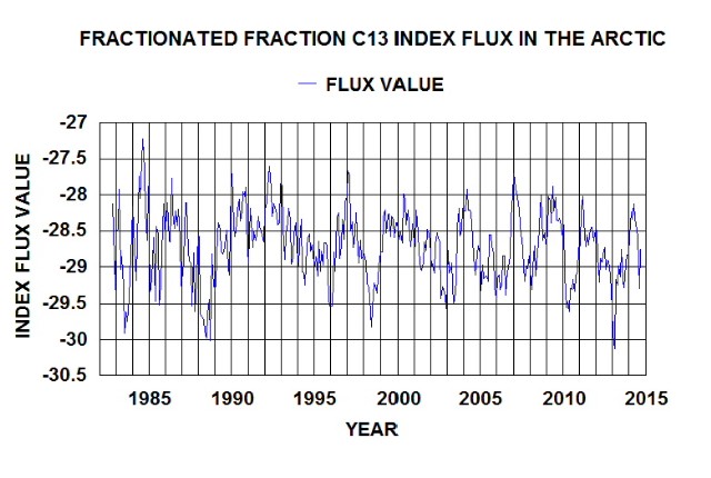
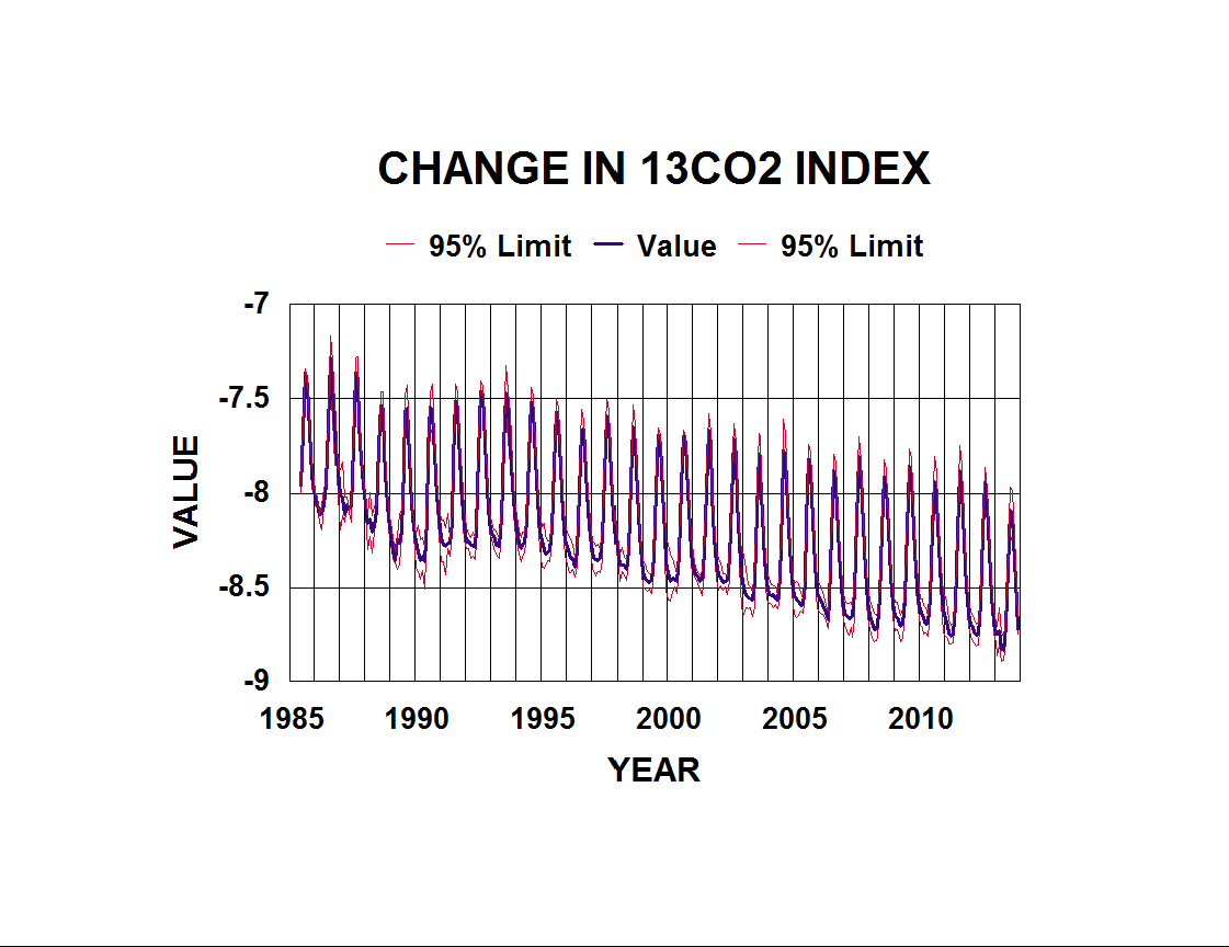
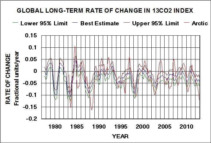
Since around 1977 both Scripps and NOAA have measured the relative concentrations of the stable isotopes of carbon in the flask samples of CO2 using mass spectroscopy. They record their results as an indexed ratio of C13/C12 with the value for C13 assigned as zero. The resulting indexed ratios are negative and get more negative with time. Since these values for fossil fuels range from around -25 for coal to around -40 for natural gas, they assume that anthropogenic emissions have caused the atmospheric values to become more negative with time. Figure 10. show that this is extremely unlikely.
An analysis of the Scripps 10 sites of monthly averaged indexed values provides additional proof that the observed changes with time are the results of natural emissions rather than anthropogenic emissions. Figure 11. presents the year-to-year changes with time. Representing a fraction of the year-to-year changes shown in Figure 9. it appears like a mirror image of similar CO2 data.
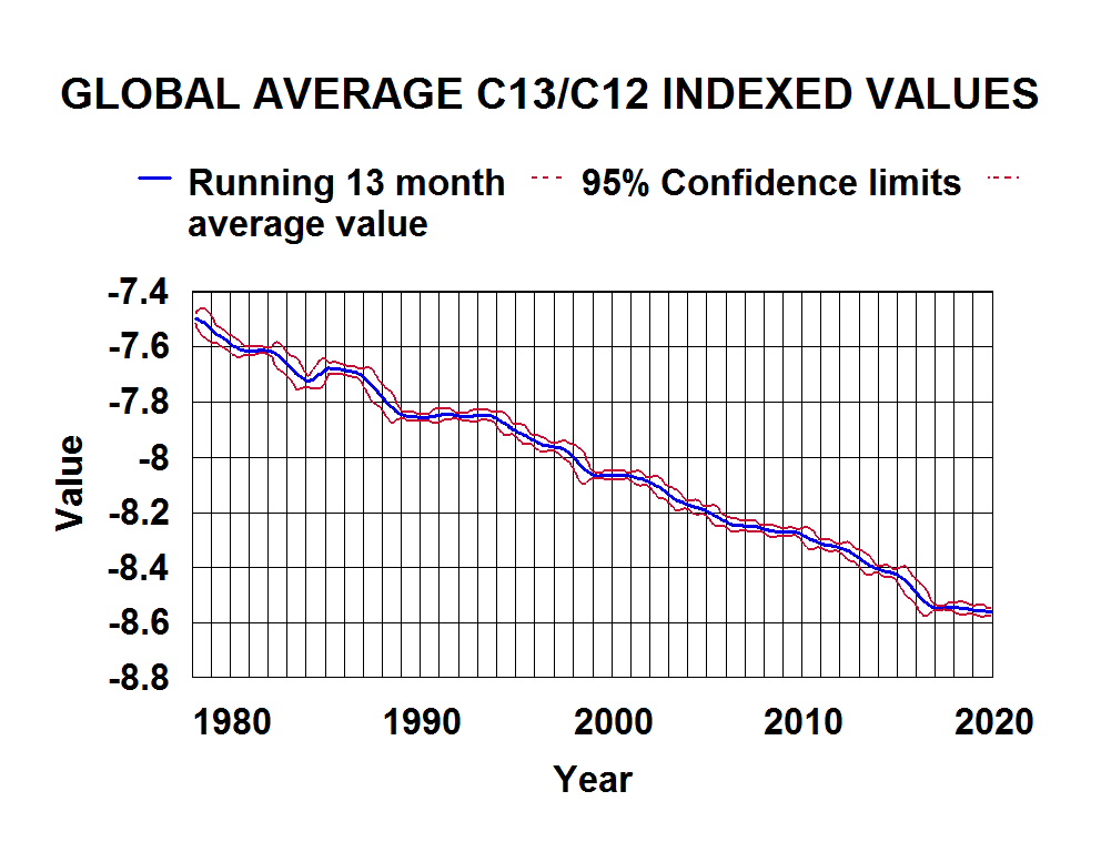
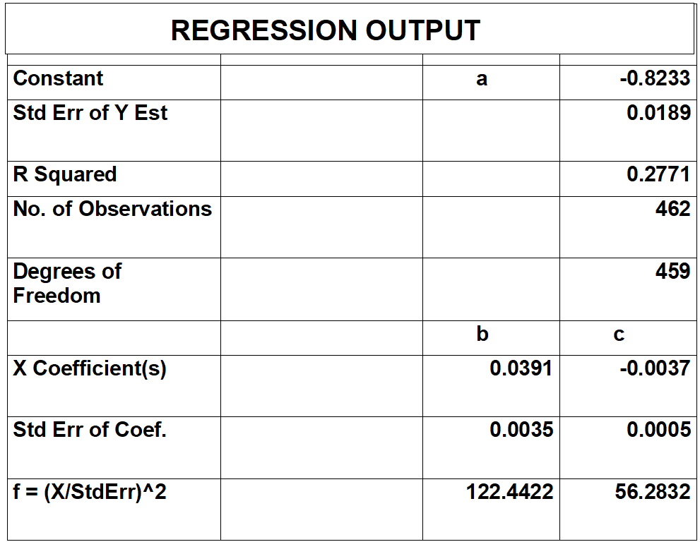
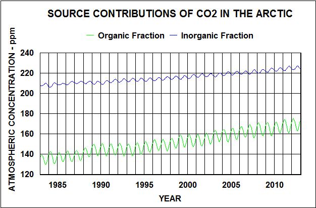
Figure 12. shows the year-to-year change in the product of the concentration data in Figure 10. (C) and the indexed values in Figure 11. (I). This product (C*I) is equal to the organic fraction concentration (DOC=Dissolved Organic Carbon) times the indexed value of that fraction because the inorganic fraction concentration (DIC) is assigned the value of zero.

The red line, representing anthropogenic emission changes, is at least an order of magnitude less negative than the blue line so it is very unlikely that it contributes measurably to the year-to-year change in concentration of the organic fraction.
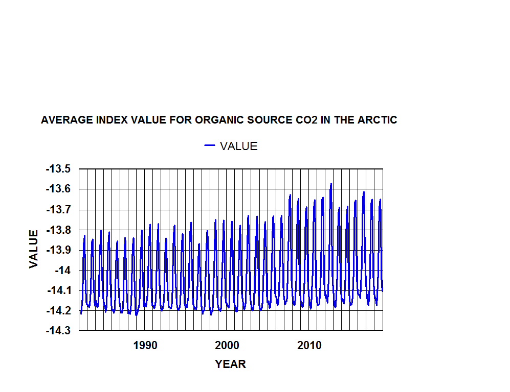
Further evidence that the year-to-year change in emission rates is natural is obtained with estimated indexed values of 13C/12C for DOC. Brittannica reports that 90% of all dissolve carbon is DOC. Seawater – Dissolved organic substances. So dividing the data in Figures 11 by 0.9 gives you estimates of changes in global indexed values of DOC in seawater from year to year. These values are show in Figure 13.
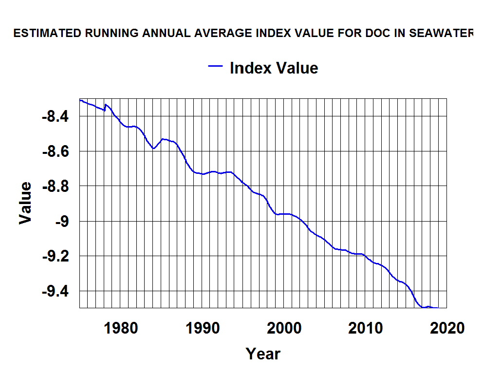
These values in Figure 13. are likely associated with increases in decaying organic matter in the surface water where plankton are most abundant. The values are not in the range of values for fossil fuels. So the “smoking gun” is no more than “blowing smoke”. It should be noted that if, as reported, 90 % of dissolved carbon in sea water is organic, all the previous figures that show total atmospheric carbon, can be reduced by 10 % to show DOC relationships.
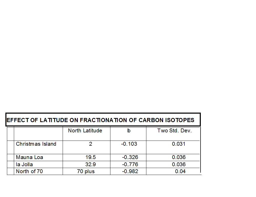
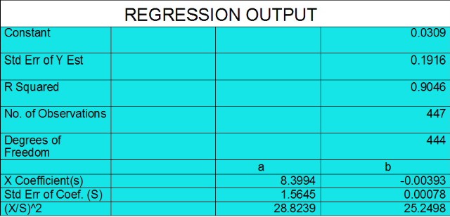
The evidence presented in figures 10 and 12 are based on analysis of average concentrations of ten sites and does not show possible errors. Both NOAA and Scripps have measured CO2 concentrations at the four “baseline” sites (Barrow, Mauna Loa, Samoa, and South Pole). Doing similar analysis on each set of date before averaging allows an estimate of possible errors to be calculated. Two sets of data from NOAA measurements in the US (NWT and KEY) were included with the eight sets of data from baseline sites in calculating the 95% confidence levels. The results are shown in Figure 14. It shows that that it is extremely unlikely for such a small anthropogenic contribution to year-to-year changes in emission rates of CO2 to be measurable. Thus, the blue line in Figure 4. is the best estimate of the natural year-to-year change in global CO2 emission rates.
Factors Affecting Year-to-year Increases in Atmospheric CO2 Concentrations
IPPC models assume the amount of CO2 in the atmosphere is the “control nob” for OLR and thus atmospheric temperatures. It is more likely that other factors including OLR are controlling natural emissions of CO2 into the atmosphere from tropical oceans. NOAA’s re-annalysis monthly average met and OLR data combined with CO2 emissions data can be analyzed to determine possible relationships. To relate the Met data to the global year-to-year data for CO2 as expressed by the blue line in Figure 4. the emission area selected for calculating the met data is from 23 degrees south to 23 degrees and 150 degrees east to 270 degrees east. This tropical Pacific area includes el Nino areas that are recognized to have strong effects on global weather. The more accurate UAH sattlelite data is used to calibrate the re-analysis temperature data.
CONCLUSIONS
More evidence that it is natural can be obtained by doing vertical energy balances in the emission and sink zone sites. That is for another blog.
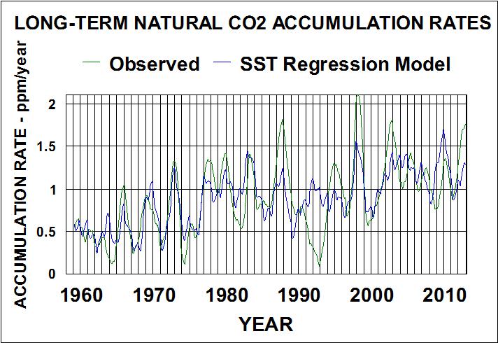
Most significant conclusion from this analysis is that trying to control the atmospheric concentration of CO2 is an exercise in futility. Natural CO2 emission rates are being controlled by water cycles of freezing/thawing, and evaporation/condensation. Thus, emission rates are strongly related to SST and dew/freeze point temperatures
Most likely atmospheric water content and clouds are controlling OLR and surface temperature, not CO2. Atmospheric CO2 is just going along for the ride.